Jack Forster has been a mechanical watch enthusiast for over three decades; he's been covering them professionally for the last 20 years. Before joining HODINKEE, he was first the technical editor, and then the editor-in-chief, of Revolution Magazine. He is also the author of "Cartier: Time Art," a comprehensive look at the timepieces of the French design house. One month ago, he put an Apple Watch on his wrist, and hasn't taken it off since. Nobody is more surprised than he is.
In April of last year, Apple launched the Apple Watch, with a design by Jony Ive and Marc Newson. Ever since Apple first announced the existence of the Apple Watch, there has been considerable speculation about what effect it might have on the health of mechanical horology, and whether or not it, and smartwatches in general, might actually pose the sort of existential threat to mechanical watches that quartz watches posed in the 1970s and '80s. Having worn an Apple Watch almost exclusively for the last month, I feel absolutely confident that mechanical watches aren’t going anywhere for now. But the Apple Watch isn’t either. It’s almost improbably well done, and it shows a willingness to think creatively that ought to be heeded by the luxury watch industry – and it also suggests to me that underestimating its impact, and Apple, is dangerous.

The Apple Watch experience starts with the packaging. Apple’s packaging is legendary; I remember the first time I noticed it as such was when I bought an Apple TV remote. It was about 20 dollars, but the packaging experience was amazing: minimalist, a perfect frame for the little sliver of aluminum inside, and it created a sense of anticipation about actually holding the remote, while simultaneously being really successful as a design exercise in its own right.
As someone in the office said irritably,“Well, of course you can make something beautiful when you have billions of dollars.”
Whoever designed it understood exactly what packaging is supposed to do: be physically seductive, but not to such a degree that it starts to set up what’s inside for disappointment. Of course the final product has to measure up. The whole experience only worked as a sort of perfect piece of chamber music because the actual remote looks like it’s for controlling the holographic entertainment center on some science fiction aristocrat’s royal yacht.


The Apple Watch packaging has been the recipient of a similar level of care. Part of any successful seduction is that you aren’t aware of the mechanics, but even if you are (or maybe especially if you are) there is an excellent chance, if it’s an artful seduction, that you will go along for the ride anyway. There’s an outer cardboard box that has what I suspect is a deliberately retro feel; you’d almost expect to find something using vacuum tube electronics inside. The inner white box is cradled between two protective formed cardboard spacers, lined with that translucent, textured, almost cloth-like plastic that Apple’s so fond of in its packaging, and the spacers have a cloth-like texture as well that’s extremely pleasant to the touch.


All these little things add up: by the time you get the inner box open, you’ve been led by the hand through a carefully orchestrated series of varied but increasingly exact textures that keeps your attention, and builds anticipation at the same time. (The packaging is different for the Sport version of the Apple Watch, but still no less calculated.)
This may seem like saying a lot about a couple of boxes, but the more I handled them, the more I think they really say something about what’s going on at Apple. This level of attention to detail isn't easy, and it also doesn’t come cheap – it encourages curiosity about just how much this kind of near-subliminal but almost disturbingly well-orchestrated experience costs to engineer, and whether it's the result of having huge sums of money to throw at the problem.


As someone in the office said irritably, when handling one of the two Apple Watches we have for review (the black DLC-coated Watch), “Well, of course you can make something beautiful when you have billions of dollars.” I don’t know about that, though. You can have billions of dollars and make something pretty awful and it happens every day.
The upshot of all this, though, is that the consumer never has a chance: you are so well treated by the packaging, and the structure of the experience is so well thought out, that you’re on the edge of your seat before you even get to opening the glassy-smooth inner plastic box to look at the watch itself.
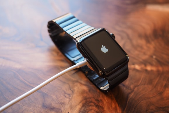
The Apple Watch setup, once you have it out, is equally well orchestrated. I’ve noticed that in general, Apple’s products come at least partly pre-charged, which means you don’t have to break the experience you were having un-boxing one of them. You turn the watch on (there's an oblong side button, which among other things is the on/off button, as well as the Smart Crown) and you’re asked to choose a language, and then you start pairing the Watch with your iPhone.

This is a lot of fun (maybe the first time in the history of Bluetooth someone’s managed to make device pairing fun). The watch displays a swirling globular particle cloud – it’s not anything in particular but it looks like it could be an abstract representation of a lot of things: flocking starlings; schooling plankton; a neural network; a star cluster sped up so that every second represents a billion years; a concept-art study for the sentient planet Solaris in the Stanislaw Lem novel of the same name. (In fact, it’s so much fun to watch I wish Apple offered it as an optional watch face.) Center the image in a frame shown in the Watch app and you’re paired automatically. You’ll then be asked if you want to do things like set up a credit card for Apple Pay, set up the Activity app, and match settings on your iPhone (the Apple Watch mirrors privacy settings on your iPhone, which is more than just a nice touch; it helps keep the whole experience from becoming confusing and overwhelming; you can also manage privacy in each app individually). How long the whole process takes depends on whether or not you choose to upload any Watch compatible apps from your phone onto your Watch, but all in all, it took less than ten minutes from the moment I turned on the Watch to actually wearing it.


Navigating the Apple Watch illustrates how Apple met the challenge of designing an interface that would have the makes-sense-instantly feel of the iPhone in something with much less screen real estate. I’d always hoped they’d put a very large curved screen on the Apple Watch, but instead, Apple’s chosen a combination of dedicated and contextual inputs that together, really do create a significantly different experience than you get in either Apple’s desktop or mobile worlds, and make much more sense than just trying to duplicate the iPhone experience (which with the benefit of hindsight, would have been an unmitigated disaster).

The touchscreen uses Force Touch extensively – if you want to change your watch face, for instance, you touch, then press slightly harder, and the existing face will shrink and drop into a row of other selections for you to flip through. (I keep forgetting I have a Force Touch touchpad on my MacBook, but using it comes very naturally on the Watch.) What the crown does is contextual – hence, "Smart Crown." For instance, when you’re looking at one of the watch faces, turning the crown activates something called Time Travel.

In the Astronomy watch face, you can roll forwards or backwards in time, and watch celestial objects change their position. That particular face also lets you choose whether you’re looking at the Earth (which will turn once a day and show you what part of the Earth is in daylight) the Moon (ditto) or the positions of all the planets – just one of the many surprises Apple’s hidden in the Apple Watch. The side button is more specific: a single press will take you to a menu showing friends who have Apple Watches (allowing you to send them Watch specific messages) while a double press calls up Apple Pay; holding it down brings up options to shut down, go into Power Reserve mode (a low power mode that shows only the time) or lock the watch. I had no issues at all with battery life, and usually found myself with at least 20-30 percent battery life at the end of any given day.

Apps are represented in an interesting way. Each app has a circular icon, and the overview of all the apps is in the form of a circular cluster you navigate with finger swipes. The icons roll in any direction you swipe, as if they’re on the surface of an invisible sphere; as the icons roll to the center position, they’re magnified. You’d have thought Apple would go with the tile-based design the iPhone uses, but in fact, the Watch app navigation system makes a lot more sense; it’s a better use of screen real estate and I found it a lot more engaging than the design for the iPhone. The iPhone’s navigation system feels, by comparison, still rooted in a desktop paradigm, including the browser experience, and I wonder whether or not the app navigation system in the Apple Watch wouldn’t make a great basis for a mobile browser. It would certainly feel more native to a mobile touch experience than the tabbed system in iOS Safari, and the tile system for organizing apps in general, which by comparison with the Apple Watch now feels restrictive.

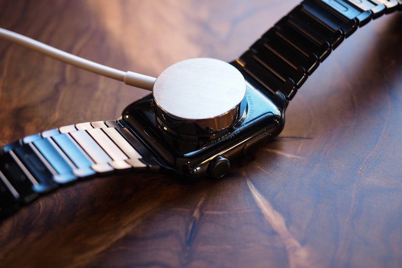
Native apps and the Watch UI are without exception legible, easy and intuitive to use, and treat the information they offer in the same way that Apple’s packaging treats the products inside: you’re seduced into engagement with the info without being distracted by the user interface. This is an especially good thing in the case of the Activity app, which, if you allow it to, will periodically nudge you throughout the day with reminders of how near or far you are from your activity goals. Heart rate is monitored through green LED sensors, which measure blood flow.

Notifications are whatever you want them to be: audible, visual, tactile, or any combination of the above. Once again, you can mirror your iPhone settings or you can set up custom alerts for any app on the Watch (this is managed through the Watch app). The haptic engine – or as Apple calls it, the Taptic Engine (it’s nice to know that even Jony Ive finds cute puns irresistible from time to time) is a tiny linear motor that can give you a tap on the wrist when you get a text message, new email, or what have you. The upshot of all this is that you can keep track of who’s sent you what without taking your phone out, and that is one of the biggest game-changers the Watch offers.

We jump back and forth between what’s on our phones and what’s going on around us, and it makes us pervasively anxious. If we’re staring at our phones we aren’t connected with the world; if we’re looking at the world, we get worried we’re missing something. The whole online social world becomes reduced to manageable dimensions with the Apple Watch. Of course, how well it does this depends on how you’ve set it up. Turn on alerts for every Facebook, Instagram, and Twitter update, as well as email, text, and Slack messages, and I suspect you’ll find the Apple Watch a nightmare; but if you can prioritize what you really feel you need to know about, the Watch has the potential to dramatically improve the signal-to-noise ratio in your life (if you can prioritize) in a way that the iPhone can’t.
If you can prioritize what you really feel you need to know about, the Watch has the potential to dramatically improve the signal-to-noise ratio in your life (if you can prioritize) in a way that the iPhone can’t.
Now, the title of this story poses a question: could the Apple Watch displace a mechanical watch? Right now I think it could.
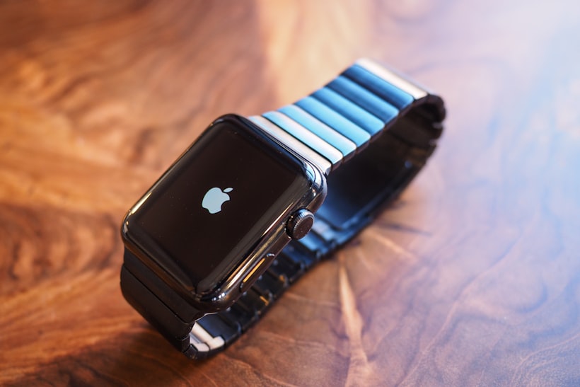
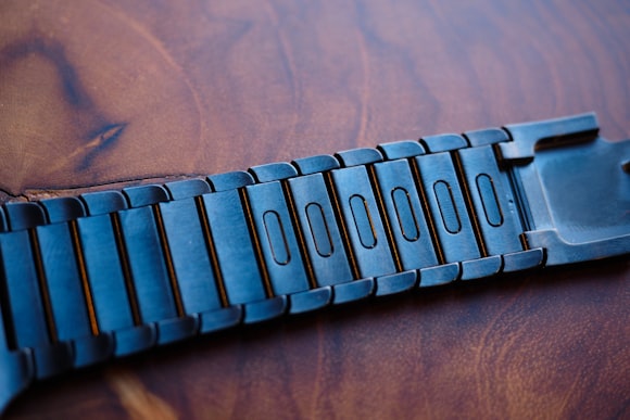
Conventional wisdom has it that the Apple Watch is only really a threat to quartz and mechanical watches in a comparable price range. I’m not sure that’s true, and there are several reasons. One place the threat is most obvious might surprise you: the bracelet of the black DLC-coated Watch. This is probably the single best designed bracelet I’ve ever seen on any watch, period. There’s a perfectly integrated double deployant clasp, and the links are beautifully shaped and machined; they have an organic flow in look and feel like the armor of a trilobite. The deal is sealed, however, by the system for adding or removing links. Six of the links closest to the clasp – on either side of it – are fitted with recessed oval buttons.

Pressing one in with a fingernail releases a double latch holding that link to the next. It’s secure, unobtrusive, and makes re-sizing the bracelet something anyone can do in seconds, with no risk of damage whatsoever. The fact that the latch system is integrated with each link, rather than relying on a sliding mechanism in the clasp, means the whole bracelet can remain very flat, flexible, and comfortable. It’s astonishingly intelligently designed and should have the watch industry really worried, and yet somehow, I’ve read almost nothing about it, either in watch specialist media or elsewhere.


It's a very nifty feature in itself, but it also shows the kind of attention to detail that luxury should be about. In dismissing the Apple Watch – or in rushing to market with poorly thought out, or obviously overpriced and cynically designed smartwatches – I think the Swiss watch industry is missing something, which is that Cupertino may understand luxury better than Europe right now. If that bracelet had been designed in Switzerland it would probably have added four figures to the cost of the watch it came on, and I'm not sure that there is a watch brand in Switzerland with the imagination to design something like this right now. It's just one part of the most expensive Apple Watch outside of the gold Edition, and the whole watch costs $1,099. I can think of frighteningly few watches at any price, mechanical or quartz, that are as well designed. Granted, Apple has a design development war chest that’s probably bigger than the entire annual earnings of every watch brand put together, and granted, they have people like Jony Ive and Marc Newson behind them. And for all its polish, especially with the latest software update, it’s still clear there are problems left to be solved – one of the biggest gaps to fill, I think, is that with three possible control inputs, it’s not always clear which should be used when. Take Force Touch, for instance; the UI really needs some sort of cue that clues you into when it can be used to access a function or change a setting; or, absent that, you have to accept that there's a learning curve in figuring out when you're supposed to use it.
I think the Swiss watch industry is missing something, which is that Cupertino may understand luxury better than Europe right now.
The big picture, though, is that you get something that has enormous thought put into every detail – both hardware and software – to such an extent that it would be oppressive if it weren't in general so good. What scares me about luxury watchmaking nowadays is that it often forgets that good design, and getting the details right, still matter. Yes, luxury is storytelling to some extent, but that often turns into products and companies that over-deliver on marketing and under-deliver on product quality, and when the gap between the story and the product becomes too noticeable people simply lose interest.

My elevator speech about smartwatches used to go like this: they’re like flying cars. The flying car seems like a great idea. But in reality, it’s an absolutely awful idea. It’s inherently flawed, as a concept, and that’s the reason they’re probably never going to exist. Smartwatches always seemed to me to be the flying cars of the wearable tech world. I never thought that Apple would succeed in pulling off creating a user experience as different from the iPhone as the iPhone was different from preceding smartphones. There were smartwatches before the Apple Watch, just as there were smartphones before the iPhone, and I’m still not sure they’ve succeeded in making something as revolutionary as the iPhone or iPod were. With smartwatches in general, success is still a rarity; there are many that are about as sexy as a traffic accident. But now we know it can happen.

I think the Apple Watch is winning the smartwatch wars right now for several reasons: better UI is one (I struggle to find Android Wear compelling, in any form, at least so far) and its ability to keep your phone in your pocket, and your head up, is another. One of its biggest secrets, though, is this: it shows every indication of having been made by people who love and understand watches, and who know that for any kind of wearable to succeed, it has to be love at first sight. And that's why it's not only a threat to other smartwatches, but to mechanical watchmaking. It’s a truism in watchmaking that the face sells the watch, but that truism is based on something bigger, which is that for something you’re going to have on your skin all day, you decide in microseconds, and with your heart, not your head, whether it’s for you. I used the word “seduced” several times in writing about Apple Watch, because its ability to be instantly seductive is the reason you give everything else about it a chance. The Apple Watch is seductive; Glass was not, and the rest is history.

It’s hard to say where the Apple Watch goes from here, but then, when the iPhone first came out it seemed to a lot of folks like a cute toy that would never be a part of people’s lives the way their Blackberries were. (I remember, years ago, a Swiss watch executive who told me with absolute, dismissive confidence, “The Blackberry is a real tool. The iPhone is a toy for my wife.” I often wonder about him.)

For people who love mechanical watches, the Apple Watch is both unimportant and important. It’s unimportant because what it offers really is totally different from the pleasure you get from a great tool watch with an amazing history, like the Sub or the Speedmaster, or the connection you get to a fusion of aesthetics, mechanics, and craftsmanship from something like a Patek or Lange. But that’s also why it’s important. And it's also why, even for luxury watchmaking, it is a little dangerous. Apple’s actually succeeded in doing with the Apple Watch what they did with the iPhone: inventing a new experience. Whether that experience is one ultimately more compelling than the one offered by mechanical watches, nobody knows. What I don't think the luxury watch world can afford is complacency. If it fails to realize that what the Apple Watch actually offers is not competition, but a convincing alternative experience – and if it doesn't take the hint that luxury is ultimately about attention to detail, not marketing or price point – it could be in serious trouble.
Don't have the HODINKEE App yet? Get years of amazing watch content plus new stories, breaking news, and access to great new features like HODINKEE Live, free on iOS.
No comments:
Post a Comment