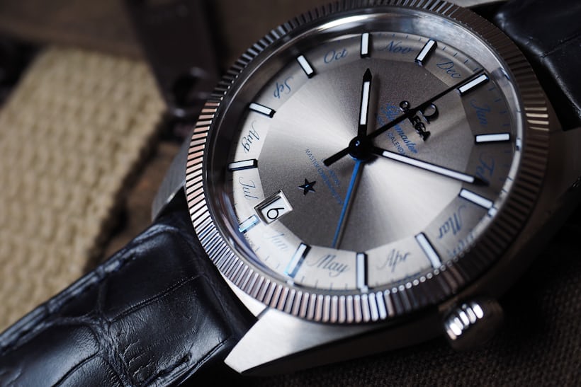
The Globemaster was originally introduced just last year, at Baselworld 2015, and back then the big news (aside from the return of a pie-pan dial, and some arguing about whether or not Omega was entitled to use a fluted bezel) was the movement, and a new type of certification for performance that came not from the usual suspects at the COSC, but from the Swiss Federal Institute of Metrology METAS. The primary additional feature of this certification is very high resistance to magnetic fields, up to 15,000 gauss, which is equivalent to 1.2 million amperes per meter. The original Globemaster is a GMT watch, with an hour hand that can be set independently, and this year, Omega introduced a new version of the same watch, with the addition of an annual calendar complication – and a font that seems even more polarizing than the fluted bezel on the original.

I have to admit that when I first saw the press images from Baselworld I was pretty put off by the lettering for the months around the dial – "horrified" wouldn't be too strong a word, as a matter of fact. Why in the world would a pretty ornate, italic script have been chosen for what is after all a very technical watch; why wouldn't you simply show the month in a window; if you have to use a pointer, why not just have it point to one of the numbers to indicate the month, et cetera. My reaction was based entirely on images from the press kit, however, and now that I've seen the actual watch here at HODINKEE, I'm not entirely sure that extreme a reaction was justified. One of the interesting things about first impressions is that they're often correct, but, of course, one of the other interesting things about first impressions is that they're often revised (or just plain wrong).

I'm still not convinced that the font was a good choice but I'm definitely no longer convinced it was a bad one, either. First of all, it's not as if Omega has never used an italic script on its watches before (if nothing else, there's the "Speedmaster" on Speedmasters, and the "Seamaster" on Seamasters). Secondly, one of the things that I didn't like about the original Globemaster was that it seemed a little stark, and the annual calendar, with the hand for the month and the lettering around the dial, seems to represent a sort of transition in the Globemaster's design. The fluted bezel and the pie-pan dial looked like an obvious recollection of vintage Constellations and they were wonderful decorative touches, but at the same time the empty expanse of dial made them seem a little incomplete. Weirdly enough, on a second exposure to this watch, I started to feel as if the extra hand and the typeface kind of rounded out the design. I still can't decide, ultimately, if I think the whole thing hangs together; and if it does work, it works in a slightly quirky way, but I'll be damned if I don't find it kind of charming on a second look (and first look in the metal).

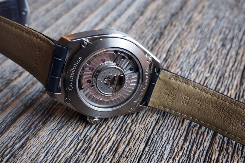
Technically this is a very difficult watch to fault, and I think Omega deserves a lot of credit for continuing to push technical watchmaking – especially at a mass consumer level, where technical watchmaking is really pretty stagnant much of the time – further along, and delivering some real value to its clients. The movement (which, in another nice nod to the past, has the Constellation observatory logo in relief at the center of the rotor) is caliber 8922, METAS certified against magnetic fields up to 15,000 gauss, with a co-axial escapement, silicon balance spring, and free-sprung, adjustable mass balance. Yes, there's a lot of modern materials science in there, but the upside is you get a watch that will keep a very close rate, and more importantly, a very stable one – certainly over the recommended service interval, and quite possible for significantly longer than that. Over a four day interval, the Globemaster Annual Calendar didn't vary on its rate at all; it was worn intermittently around the office during the day, and left dial up at night. My impression of Omega's current family of co-axial calibers is that this is probably typical.

Overall, I had a much more positive impression of this watch than I expected from the press photos. One of the reasons we asked Omega for this particular Baselworld introduction was because I was pretty curious to see if I'd hate it in person as much as I thought I was going to, and as it turns out I didn't. The annual calendar is synchronized to the GMT hand, which can be set either forward or backward; the movement is as solid and reliable as you could want in a mechanical watch; and the aesthetics – well, they're a little off the beaten path, but they give the watch itself character and I think they also give the Globemaster design a little more personality. I think we've got a tough, practical, if somewhat quirky timepiece here, and at $8,600 as shown, a GMT watch with a lot under the hood and a synchronized annual calendar is a pretty great value as well. If you want a solid travel watch and find the aesthetics appealing, this is worth looking at (or looking at again, if, like me, your first impression was based on PR shots).

The Omega Globemaster Annual Calendar: Case, 41 mm x 14.71 mm, available either in Sedna Gold or stainless steel with tungsten carbide "hard metal" scratch-proof bezel. Water resistance, 10 bar/330 ft. Sapphire crystals front and back. Movement, Omega co-axial "Master Chronometer" certified by COSC/METAS. Bidirectional winding, 25,200 vph (3.5 hertz) with 55-hour power reserve; NIVACHOC shock protection. As shown, $8,600; expected to be available in November. Omega's Baselworld 2016 novelties are all online right here.
For your mobile reading pleasure, with years of archived watch content plus new stories, breaking news, and access to great new features like HODINKEE Live, download the HODINKEE mobile app, free on iOS.
No comments:
Post a Comment