Last year was the 10 year anniversary of MB&F. The company is remarkable for many reasons, but one of the most interesting things about MB&F is, in a way, that it's still there at all. Being a relatively new, independent watch brand, especially nowadays, is a risky proposition; the leverage and resources that come from being part of a larger group aren't available, and you don't benefit from the heritage that older independent firms like Rolex, Patek, and Audemars Piguet enjoy (though heritage presents a whole different set of challenges). In the years since MB&F was founded, there have been many attempts to make watches that push the design language of watchmaking and many, maybe most, of those efforts are now just memories. In retrospect, the single most important shift in the market for watches has been the unprecedented, and unexpected, rise of vintage watch collecting, which for many is where the real action is.
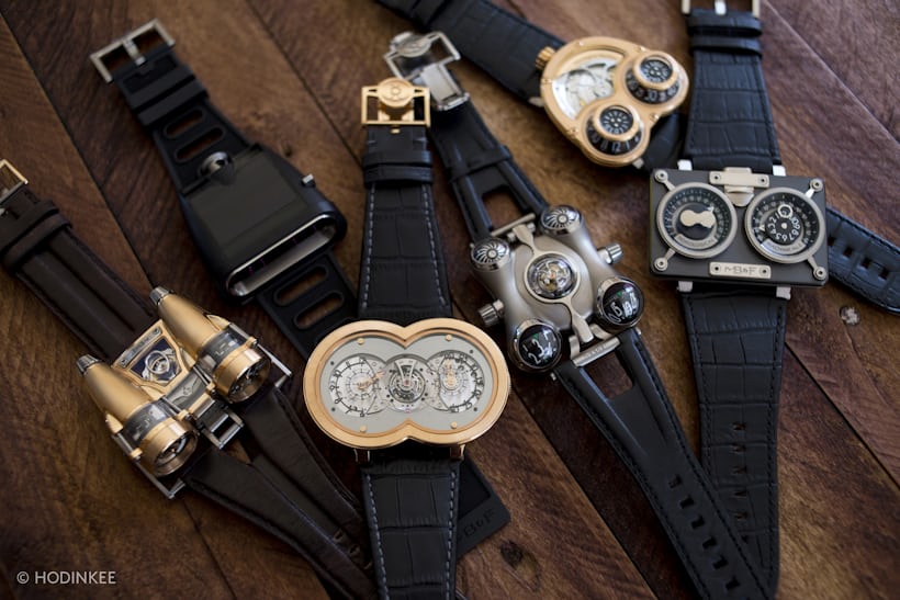
And yet, despite all this, MB&F has managed to survive and even thrive. Part of the reason, of course, is luck. But a more important reason is a consistency in inspiration and in design language that has eluded many of the other so-called avant garde watchmaking attempts. That there is a a consistent design language is clear when you look at the Horological Machines together. At the same time, each Machine is clearly different from the others, and each is successful in its own way. We all probably have our personal favorites (I have a long-standing weakness for HM2) but overall, there's an almost unbelievable level of both conviction and coherence that comes across when you look at all six Machines together. To do this sort of thing successfully in even a single watch would be remarkable; to do it with such consistency, over and over again, in an industry where just developing one such watch can easily take four to five years, is an achievement I don't think anyone else has matched.
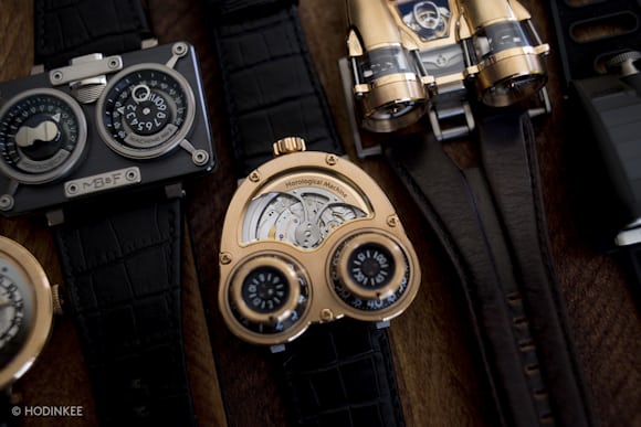
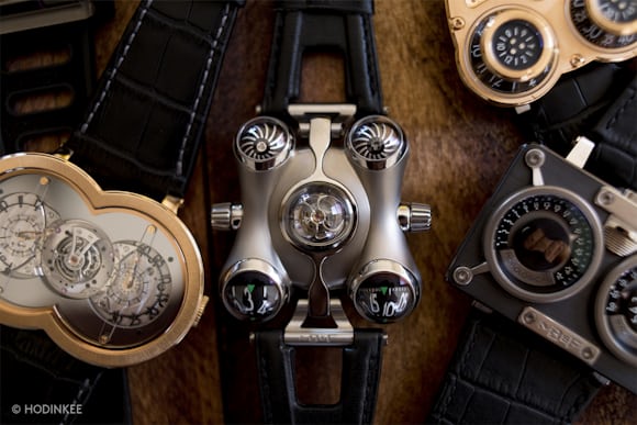
We were lucky enough to be able to get all six Horological Machines together in one place for a shoot several months ago – and here they are.
Horological Machine No. 1
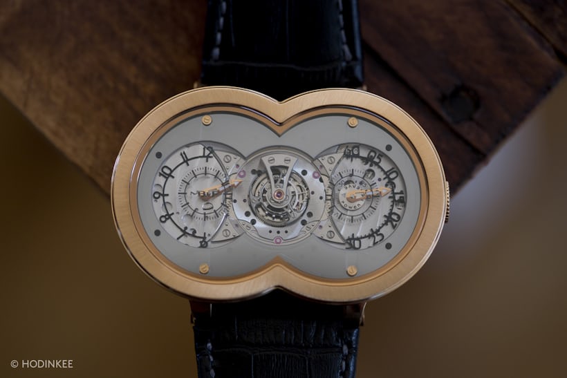
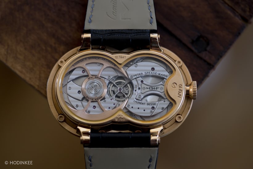
HM1 established a great deal of the basic design vocabulary of the Horological machines, and largely, despite their diversity, the subsequent HMs would adhere to the basic concepts found in the very first. The most obvious of these are the use of a shaped movement, which produces a seamless integration of design and mechanics, and the decomposition of the single dial of a watch into a double display. As well, there's the connection to related but diverse cultural genres, like science fiction, cyberpunk, and steampunk – but never in a too-literal fashion; one of the reasons MB&F's appropriations work while so many others do not, is because the design cues borrowed always work in the abstract, as formal elements, as well as cultural signifiers.
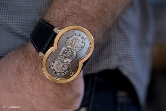
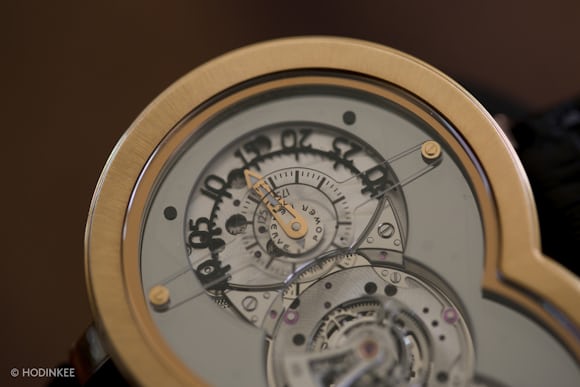
At the same time, despite the very unusual overall design, HM1 is also very much a manifestation of tremendous respect for the codes of classical watchmaking. The movement finish as well as case finishing largely eschew anything that might smack of novelty for its own sake, and this combination of a custom movement with excellent, but very traditional finish, as well as a design that seems an organic manifestation of the movement construction, can to a greater or lesser degree be found in every subsequent Horological Machine.
Horological Machine No. 2
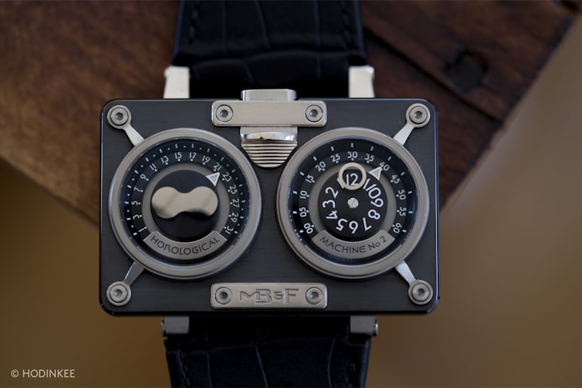
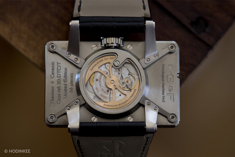
As much as I hesitate to say any of the Horological Machines are about anything – they're not the horological equivalent of program music and they're not literally illustrative of any narrative in particular (which in fact, is why they work) at the same time, each one does represent a kind of perspective on time and timekeeping. HM1 deconstructs time, breaking apart the hours and minutes and letting them semi-coexist; HM2, on the other hand, uses the dichotomizing of time first presented in HM1 as a vehicle for complications.
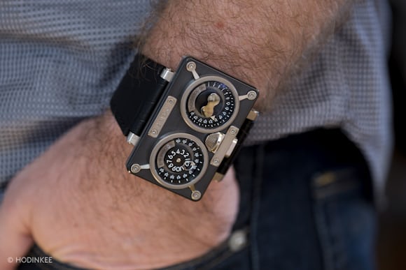
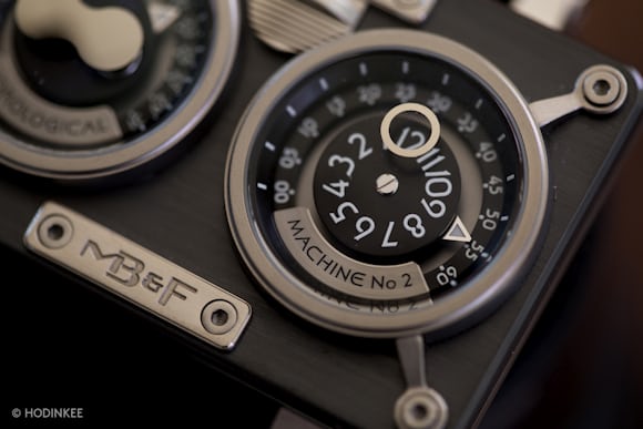
Horological Machine No. 2 has a double-hemisphere moonphase, retrograde date, and retrograde minutes, with the hours show separately in a round aperture. Once again, the components of a classical watch – this time, a date watch with moonphase – are given room to be individuals and distinct design elements in their own right, and at the same time, to co-exist with, and modify the perception of, other aspects of a conventional watch.
Horological Machine No. 3
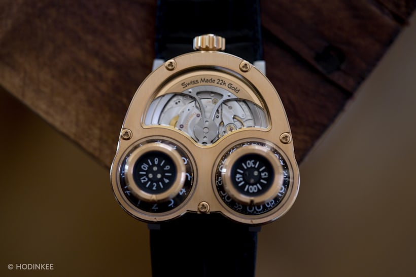
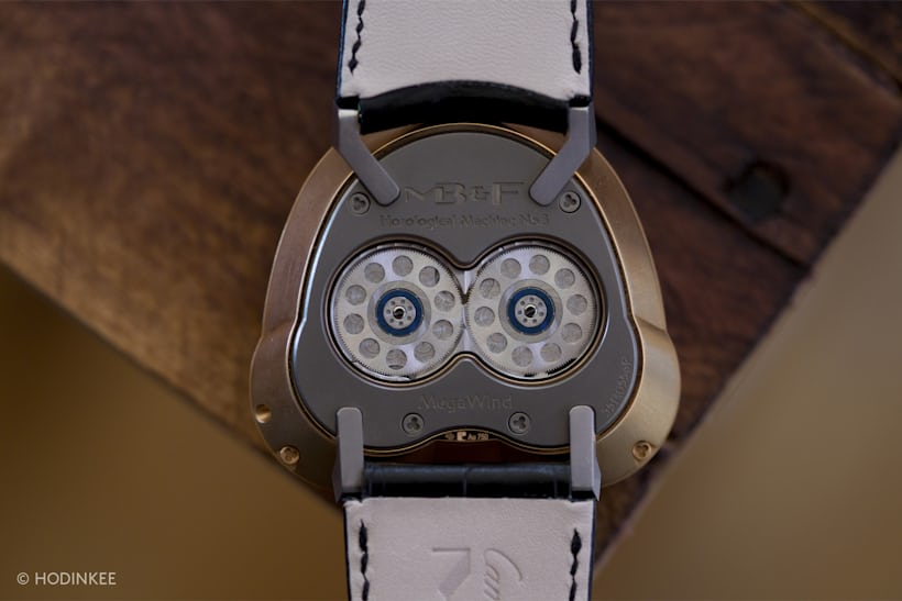
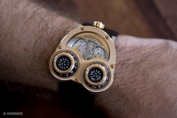
Each of the Machines eventually came to be offered in a variety of models, with different case materials, finishing, and so on, but HM3 came in two variations at launch: the Sidewinder and the Starcruiser (depending on whether the two "time cones" are parallel or perpendicular to the long axis of the forearm). The HM3 continues the theme of splitting the experience of time into two domains, but in a very interesting way – since the time is displayed on the flanks of the two time cones, you can't actually read the time without looking at the watch at an angle. Most watches are basically a two-dimensional experience (in fact, for much of watchmaking, making a watch as two dimensional as possible was an aspirational goal) but HM3 is insistently three dimensional, and it was when it was introduced, by far the most sculptural Horological Machine.
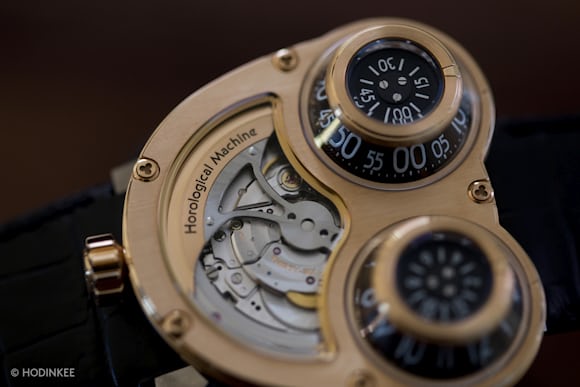
Horological Machine No. 4
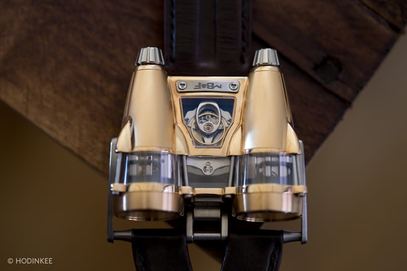
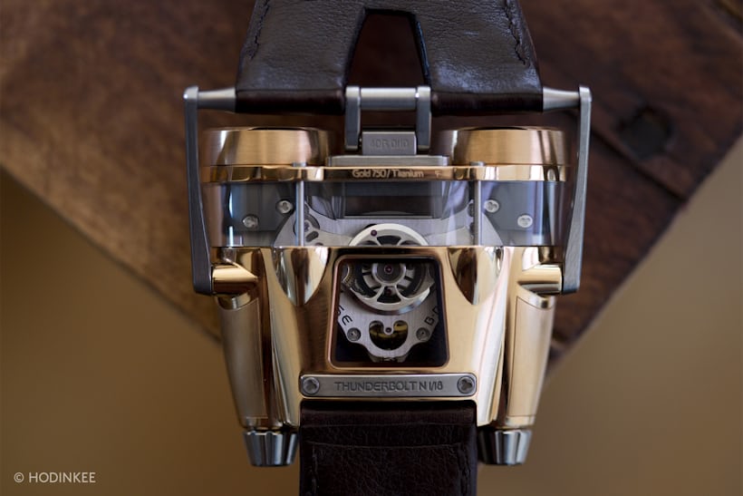
After the increasingly cerebral development of the first three Horological Machines – with their reinterpretation of the experience of time as a fractured, multidimensional one – the playfulness of HM4 comes as a relief – one can't help but think, to Max Büsser and his team as well. I've said that the Horological Machines aren't program music; that is, they're not literal illustrations of their inspiration – but with HM4 we have perhaps the most literal reflection of source material so far.
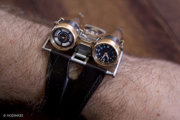
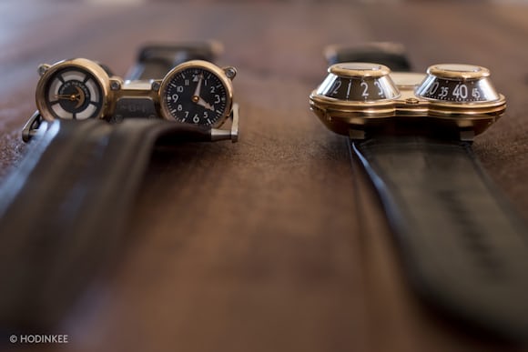
You can't look at it without instantly thinking of everything from twin turbo jets to the pod-racers from Star Wars: The Phantom Menace, and when you first pick the watch up it's all you can do to not make it do little swoops through the air while you make furtive whoosh whoosh noises. The end result of all this is a watch that, while perhaps not the most ironically post-modern or Jules Vernian of all the Horological Machines, was certainly the most flat out fun so far – one that makes you think that after three elaborate re-interpretations of childhood inspiration, Max was relaxing and enjoying himself.
Horological Machine No. 5
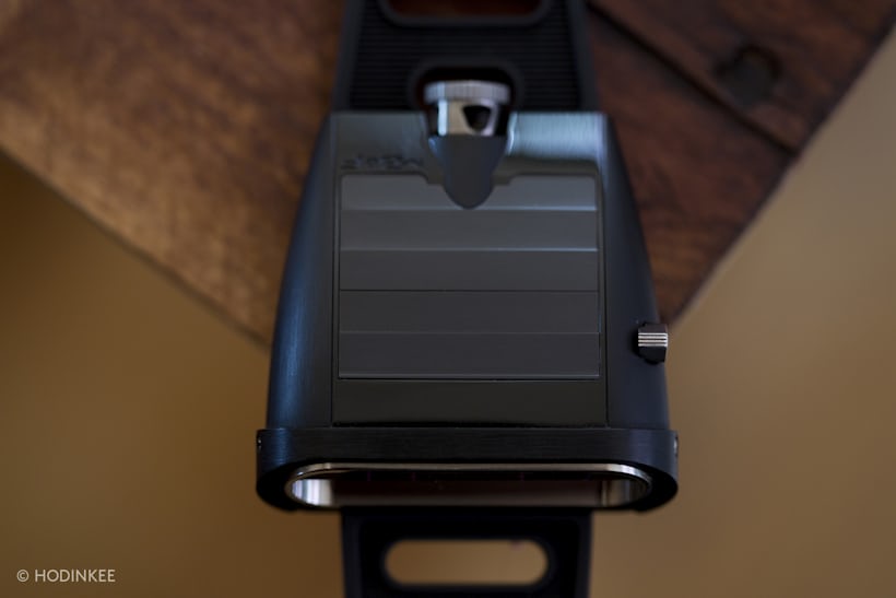
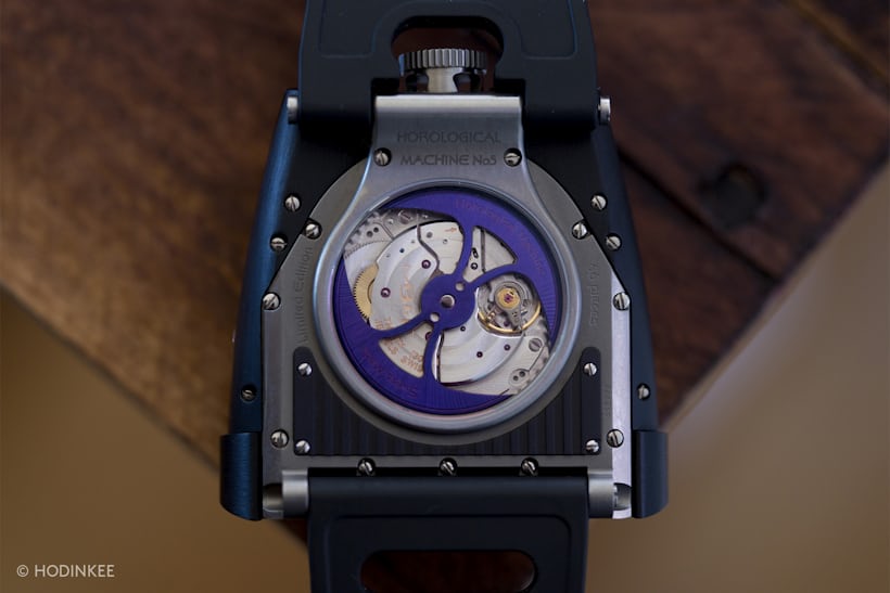
Horological Machine No. 5 appeared in 2012, and HM4 in 2010; in the interim, MB&F released the much talked-about Legacy Machine 1. Perhaps as a palate cleanser, HM5 is about as far from the refined, no-holds-barred exercise in reimagined 19th century haute horlogerie that is LM1, as it is possible to be. The watch was an intriguing blend of influences – the Lamborghini Miura was one; the '70s watch known as the Amiga Digitrend was another – with louvers on the upper surface that can be opened to let light in, to charge the lume on the disks carrying the hours and minutes. Those disks actually sit flat, and they're reflected laterally and enlarged by a prism of optical grade sapphire.
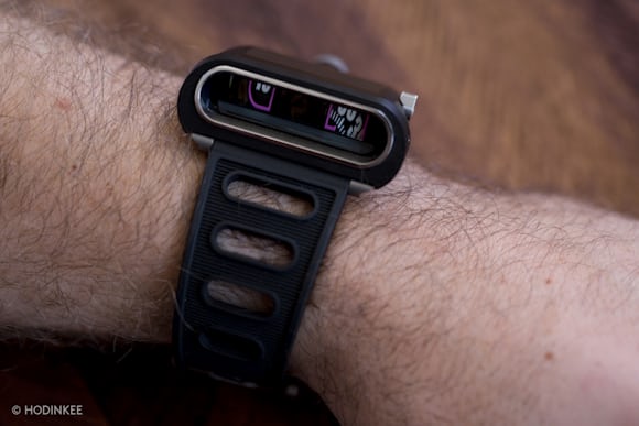
Again, a slightly more overtly illustrative take on an inspiration, and very much one of the more playful Horological Machines – but at the same time, one with just a slightly sinister, Darth Vader-esque edge. You can call MB&F watches many things – playful, ironic, subversive – but one thing they never do, despite drawing on childhood wonder for inspiration, is become too saccharine for their own good.
Horological Machine No. 6
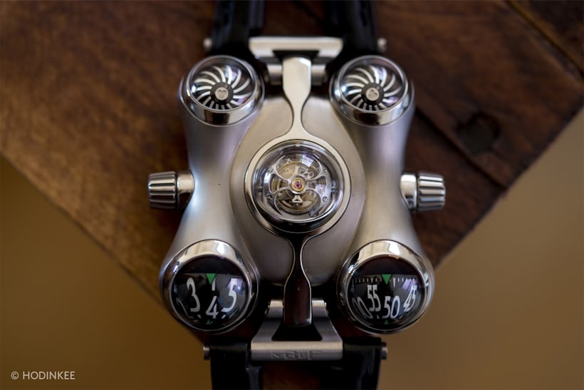
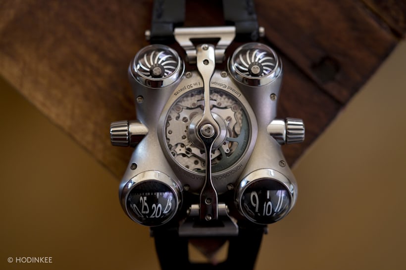
The most recent Horological Machine is HM6 – the Space Pirate. The name, obviously, is meant to suggest a marauding privateer of the spaceways, but the watch at the same time has a gentle biomorphism that seems to belie the slightly aggressive name. Maybe the Pirate is a reluctant one, forced into privateering by an oppressive Galactic Empire – who knows. In any case, it's a highly fanciful and stylized interpretation of the inspiration, and to me one of the most interesting of all Horological Machines. You have, on the one hand, a highly abstracted and abstract representation of the spaceship concept; on the other hand, you have the twin rotors (functional; they're geared to the winding rotor and act as air brakes to prevent excessive wear in case of over-vigorous arm movement), which really ground the whole design in that inspiration.
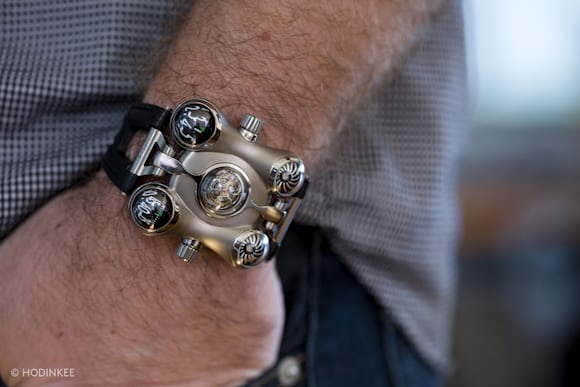
As with HM5, you get to play with the watch as well, not just wear it – one of the crowns opens and shuts a little dome over the tourbillon. Ostensibly, this is to protect the lubricating oils from breaking down prematurely due to UV radiation in sunlight, but the childish pleasure afforded by fiddling with the little dome is all the raison d'être it needs, frankly.
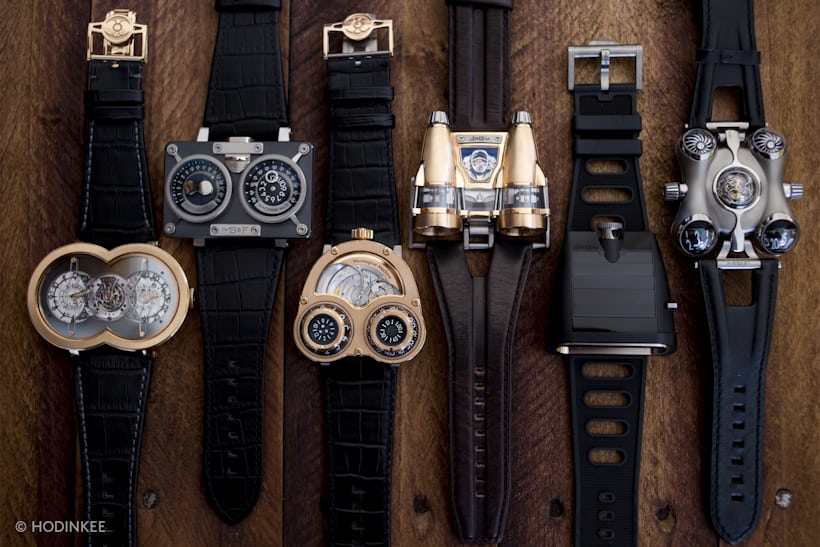
As we've said, to see them all together isn't an experience too many people have had; certainly, outside of very serious collector circles, it's not one most of us can have. It's a fascinating experience; that they all seem so individual, and yet that they resonate with each other on so many levels, is really a testimony to the creative energy at MB&F and the value of real, open collaboration in keeping creativity from stagnating. While of course, Max Büsser's name is (rightly) most strongly associated with MB&F, it's as much his talent for collaboration as his talent for design, that has made the company what it is today: a unique outpost of design excellence in the often uninspired world of watch design.
Thanks to MB&F for logistical support in helping make this Gathering of Machines possible.
Photos: Will Holloway
No comments:
Post a Comment